Designed a scalable, accessible, and efficient design system to support Hopin's multi-product strategy.
Role
Design system designer
type of work
UI design
Product design
Design system
Team
In-house design system team
Client
Hopin
Year
2023
Project background
Setting the foundation for a Multi-Product Strategy
When Hopin expanded its portfolio by acquiring platforms such as StreamYard, Boomset, Session(ex. Jamm), and many more, we faced a unique challenge: ensuring a cohesive user experience across multiple products while maintaining each product’s unique identity. My role as a design system designer was to tackle this challenge by developing a scalable, efficient design system that would simplify cross-product experience and improve consistency.
Design tokens & Figma file organization

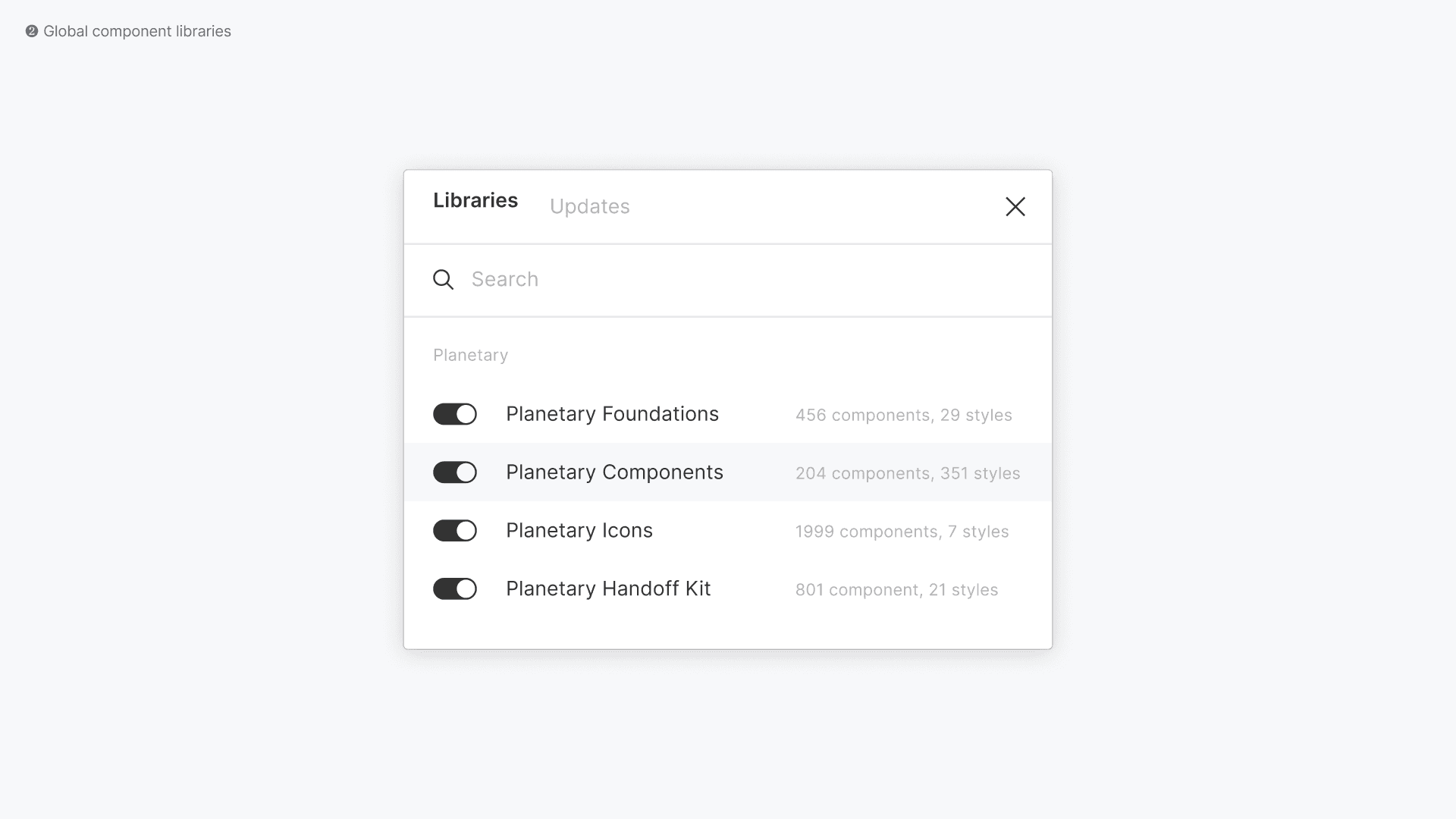
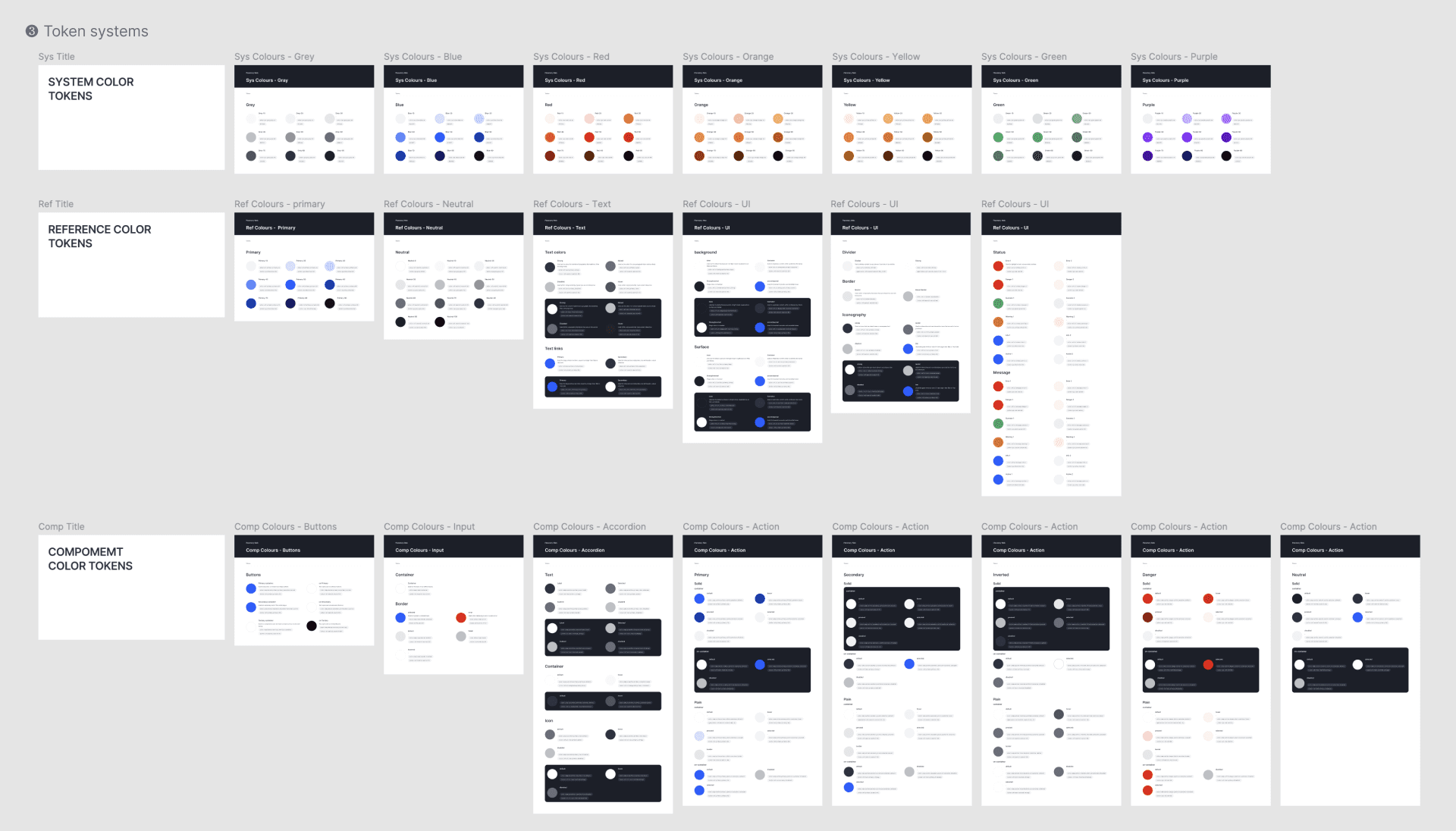
To support Hopin's multi-product strategy, we utilized ²centralized Figma libraries and ³design tokens to standardize elements like colors, typography, and spacing across products. This approach simplified system management and created a scalable structure that could evolve with Hopin. Figma’s file structure supported shared UI components and allowed for ¹brand-specific adaptations through individual product libraries.
Designing for product designers
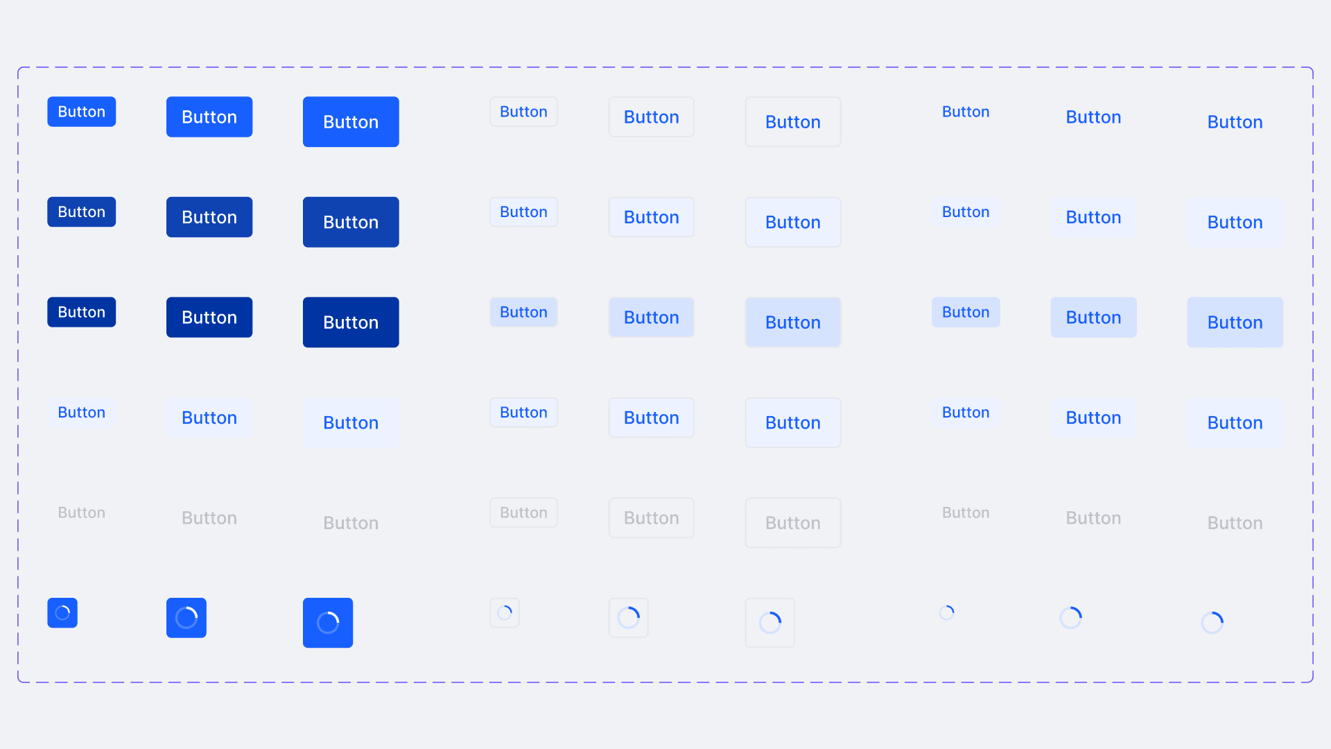
A unique aspect of this project was that our "users" were product designers, not just end-users. The design system was created to streamline their workflows, allowing them to focus on their product vision rather than managing the finer details of UI components. Having experienced the frustration of inconsistent component use myself, I knew how confusing it could be. To address this, we designed flexible components with various states, sizes, accessibility features, and customizable nested options. This approach ensured consistency across products while giving designers the freedom to adapt components to their specific needs, making implementation more intuitive and efficient.
Evaluating product needs in systems thinking

Understanding product needs required mapping out scenarios and use cases to ensure the system accommodated diverse requirements. This approach kept the design system flexible for different teams while maintaining consistency across the ecosystem.
Efficiency through tokens and documentation

By leveraging tokens and thorough documentation, we provided product designers with ready-to-use elements. This allowed them to focus on product-specific tasks without worrying about inconsistencies in design.
Inclusive products consist of accessibility components


Accessibility was built into every component. Each UI element met ¹color contrast, keyboard navigation, and screen reader compatibility standards. This ensured designers could focus on product visions without needing to check for accessibility compliance, as the system adhered to WCAG standards, making inclusive design effortless.
We ensured that designers were handing off product-specific accessible design solutions by developing ²detailed accessibility handoff guidelines. These guidelines helped streamline the process, making it easier for designers to prepare clear documentation for engineers to meet accessibility standards.
Learning to think in systems


This project was more than just about creating UI components; it required thinking in systems. Each component needed to fit into the larger framework, ensuring scalability and the ability to evolve with Hopin’s product line. By focusing on scalable, low-cost solutions, the goal was to address multiple product challenges efficiently without sacrificing quality.
Working on specific product problems often risks losing sight of the bigger picture—how the UI should behave across an entire ecosystem. This project was a unique opportunity to design small pieces of a product while constantly considering their role in the larger framework. Components were mapped to support user flows and business goals across different products. The relationships between design, technical constraints, and user needs were always kept in view to ensure cohesive, long-term solutions. Cross-functional collaboration provided continuous feedback, ensuring that each piece fit seamlessly into Hopin’s evolving multi-product strategy.
Designing shared design language (SDL)
We developed reusable UI components within the Shared Design Language (SDL) framework, a system designed to ensure consistency across Hopin’s diverse product offerings. SDL establishes universal design patterns and principles that allow different teams to work cohesively, ensuring that key design patterns—such as navigation bars, side panels, and app switchers—are implemented consistently across multiple products. This approach aligns with Hopin's multi-product strategy, where various products share a unified design language to provide seamless user experiences while still catering to the unique needs of each product. My work focused on aligning components with product-specific needs while adhering to SDL, fostering collaboration and a cohesive experience across Hopin’s ecosystem.
Here are some featured components I worked on:
Top bar

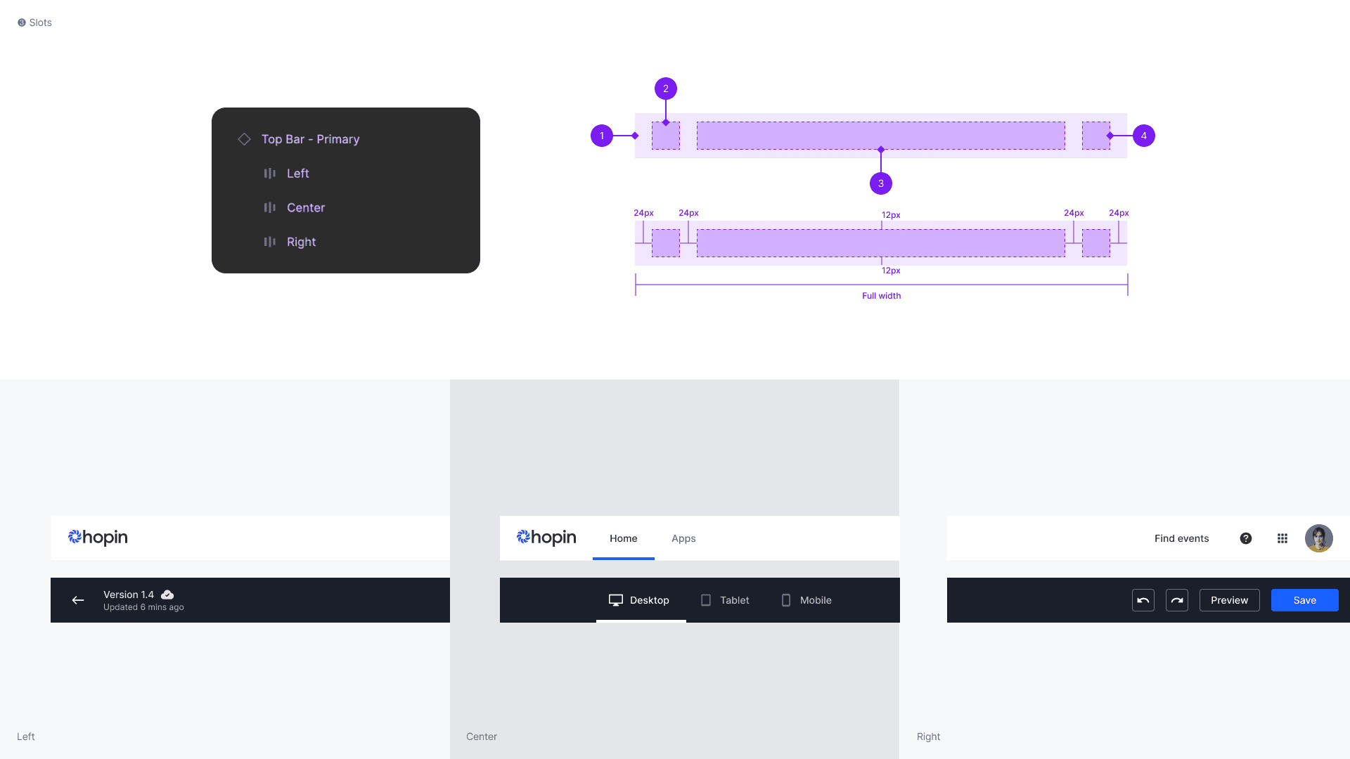
¹The top bar was designed for seamless navigation across different products and within the same app, maintaining a consistent structure throughout. This consistency helps users build a mental model of how to interact with various products, regardless of where they are in the product space.
²The initial component is intentionally left empty, containing only ³customizable slots so that product designers can tailor the navigation bar to fit the specific needs of their product.
Chat

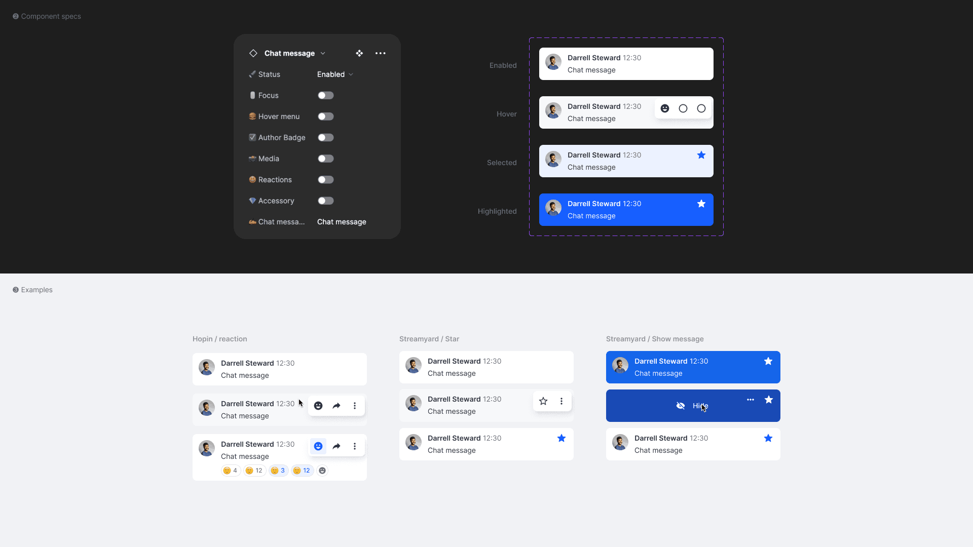
¹The chat component aligns with the SDL by maintaining consistency across products. It includes ²standard patterns like avatars, usernames, messages, and timestamps, with additional tools (replies, reactions) as needed. Flexible states ensure clarity, and features like organizer indicators and hover menus enhance usability. This structure allows the chat component to adapt across products while preserving a unified design, supporting SDL's goal of reusable, consistent components.
Audio & Video Control
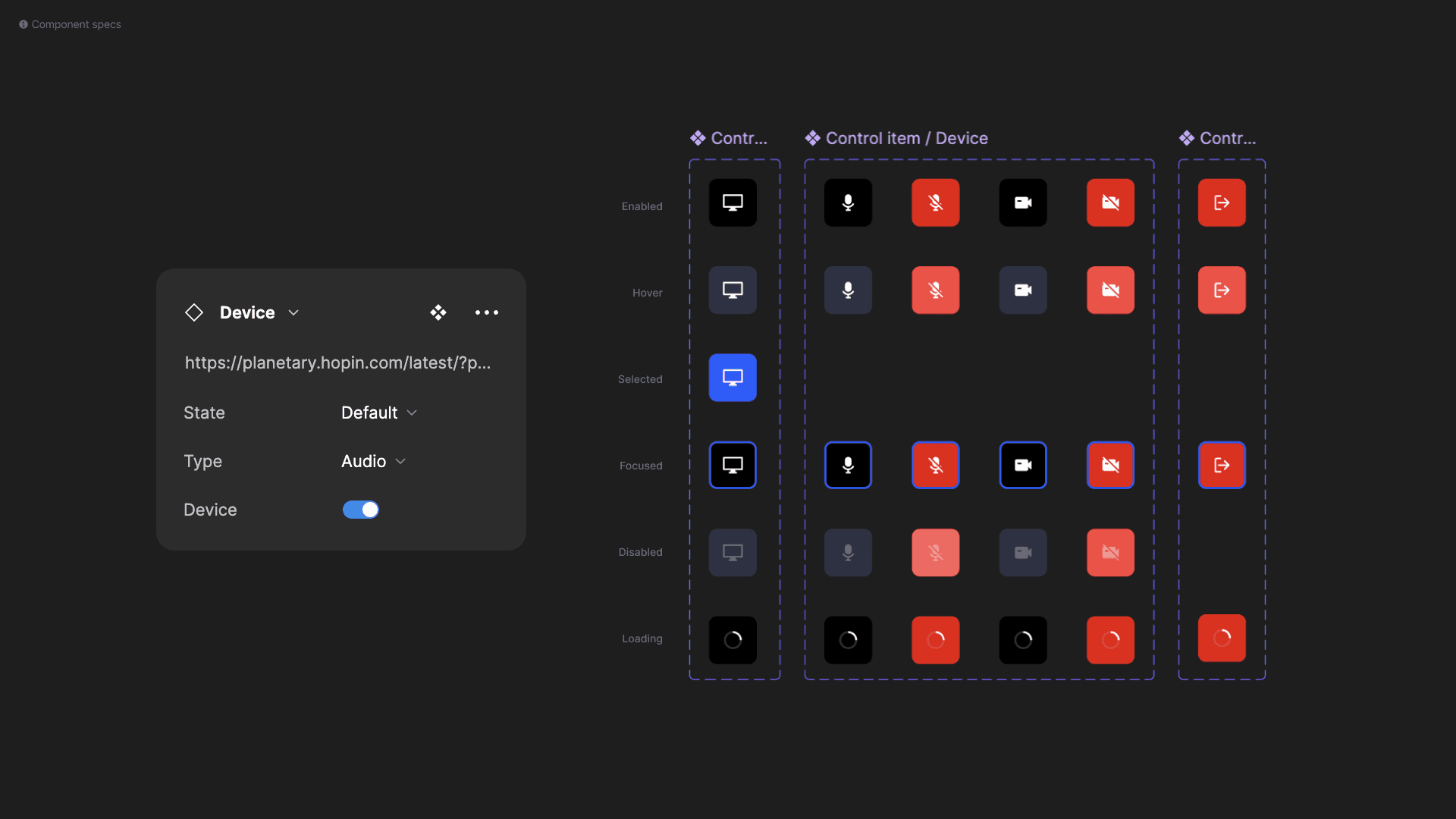

¹The AV control component gives users intuitive control over key actions during video calls, such as toggling their mic, camera, captions, and screen-sharing. Key controls, like the audio/video switcher and leave buttons, are ²standardized across products to maintain a familiar structure. This approach allows designers to implement the component consistently across different user journeys.
Help designers self serve

While the Figma component library provided a strong foundation for component usage, it often wasn’t enough to fully convey the complete functionality of each component. To bridge this gap, the design system team invested heavily in comprehensive documentation, covering features, usage guidelines, behavior, and best practices. This ensured designers could implement components without constantly needing clarification. By offering clear, accessible instructions, the process increased efficiency across teams, allowing designers to focus on their tasks while maintaining consistency throughout all products.
Reflection
In this project, I had the privilege of working alongside incredible designers—Jon Atkins, João Costa, and Matt Kay. They were true mentors, guiding me through the process, reviewing each other's work, and fostering a collaborative environment. Design systems were new for everyone involved, and together, we were constantly learning and evolving through detailed design reviews and knowledge sharing.
This experience sharpened my attention to detail, significantly boosted my UI skills, and, most importantly, deepened my ability to think in systems. Working in a fast-paced startup environment, where rapid iteration is key, often caused us to focus on solving immediate product problems. It can be easy to lose sight of the bigger picture in this setting, but this project taught me how to design smaller pieces with a broader systems perspective in mind. The insights I gained here have been invaluable in helping me balance the need for speed with long-term scalability and consistency.